Caxton – pro page layouts in Gutenberg
Caxton … by PootlePress … may be a plugin with unusual name but Matt Mullenweg loves it so I guess that puts me in good company because I love it too.
Matt Mullenweg said this about Caxton: “The sites people are creating with it are just gorgeous” and he is right, I can see a time when this plugin … and others like it … will totally replace themes.
So what is it … apart from a rather unusual name? “Caxton is a collection of awesome blocks that make it easy for you to create beautiful WordPress pages.” It allows you to create pro page layouts in Gutenberg.
The blocks
Installing Caxton is done in exactly the same way as you would install any plugin. Install > Activate > and … there’s an almost 3-minute video that explains some of the workings of the plugin.
I should say here that as I write this … on August 19 … the plugin has not been tested against the latest version of WordPress … 5.2.2 … but it works fine on the sites that I have installed it on.
The blocks that are included with the plug-in are:
- Advanced layout block
- Shape dividers block
- Posts grid block
- Photo slider block
- Call to action block
- Typography block
- Icons block and a
- Button block.
These blocks allow you to:
- Add backgrounds to sections
- Create nested rows
- Create parallax rows
- Create beautiful transitions between blocks
- Allow you to customise each block and
- Give you advanced mobile controls
What you see
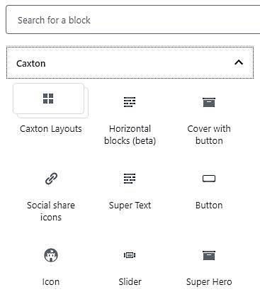
To access Caxton when you’re working with a page or post simply start a new block and choose the plug-in from the menu that appears.
You will then be shown a menu that looks like this and there are two more tabs that are out of sight on this screen grab. Those tabs are ‘Shape Divider’ and ‘Posts grid’.

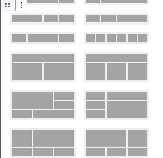
Click on the Caxton Layouts tab and you will see a screen that looks like this:

Once again there are more options than I could fit into a screen grab but there are five rows above the top one in the image and they give you the more basic page layouts.
For me, this is where the magic happens because there are so many layout options to choose from and when you put a couple of these together you can come up with your own template for a website.
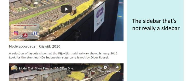
For example, here is a snippet cut from a page on a website I’m currently building. It’s a site where I wanted different sidebars for some of the pages. You can combine a plugin with some themes to get individual sidebars and you can certainly achieve the same results with more expensive themes, such as Avada … but I wanted a bit more control for no extra money.

So what you see in the screen grab looks like your average web page combined with a sidebar (that is yet to be populated with advertising) but what you are really seeing is the Caxton layout option of two columns where the first column is about 2/3rd wide and the other column is 1/3rd wide.
And because of the background options that the plugin gives me I can provide a coloured background for the pseudo sidebar.
There is so much more to explore in this amazing plugin … I’ve been using this plugin for several weeks and I still haven’t used everything … but if you’re looking for a way to change the look of your site to something a little less conventional then this is the plugin that will really do it for you.
My Rating:


